Here at CloudZero, we’ve made some updates to our dashboard that we’re excited to share with you!
When you hear the word dashboard, if you’re not thinking about software, you’re probably picturing the place in a car where you have various dials and readouts for safe operation of the vehicle. But did you know what the term dashboard predates cars? It originally referred to a barrier on a horse-drawn carriage designed to “protect the driver from mud or other debris “dashed up” by the horses’ hooves.” Later, the same barrier protected drivers of early cars from debris being flung up by the tires or, eventually, from the heat and exhaust of the engine.
I actually prefer this original definition. If you think about roads that were used mostly by horses, you can imagine that the “debris” that would otherwise be flying into the driver’s face was pretty nasty. So, one might say that a dashboard, literally, kept the s&*t from blowing up and hitting you in the face. As software developers, what could be better than a barrier that keeps s%&t from blowing up in our face? That’s what a good dashboard should do, and you’ll find it in CloudZero. So, without further ado, here are some new features to our dashboard.
Cost Anomalies
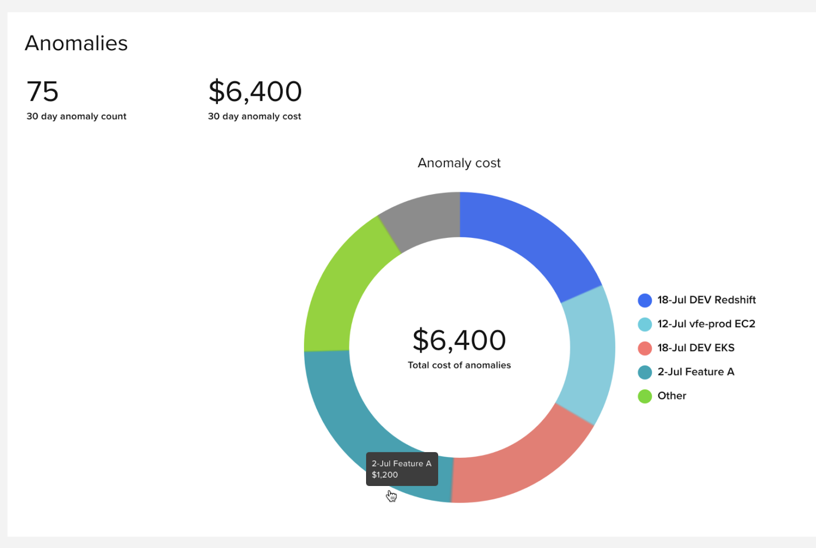
CloudZero uses machine learning to automatically detect unexpected increases in spend and alerts you before they run for days or weeks. No more end-of-month freak outs from finance. The CloudZero dashboard gives you a quick view of those anomalous costs – both the frequency of unexpected costs and the actual dollar impact of them. It’s important to know the difference between when you have lots of small cost spikes or just one whopper. In either case, it’s s*$t that you don’t want blowing up in your face!
Top Changes
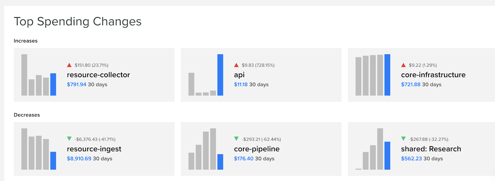
There are plenty of places where you can see what you spent on a given AWS service over the past month. But you don’t have an EC2 team. You don’t have a product called Redshift. You have teams that build your own products and features composed of microservices that rely on multiple AWS services. Seeing that your DynamoDB spend went up or down only helps if you know the business context in which that spend has an impact. And you really don’t care if the spend is exactly the same month over month. You care about changes. The CloudZero dashboard shows the most significant spending changes – both increases and decreases – by feature. Your feature, not AWS’s. Not all spend, but spending changes that you should know about. At a glance, you can see if a team had a sudden spike in spending which you may want to drill in to (keep that from blowing up in your face later!) Or if a team invested in reducing some tech debt, you may see their spending decrease. Hey, you should buy them lunch!
Treemaps
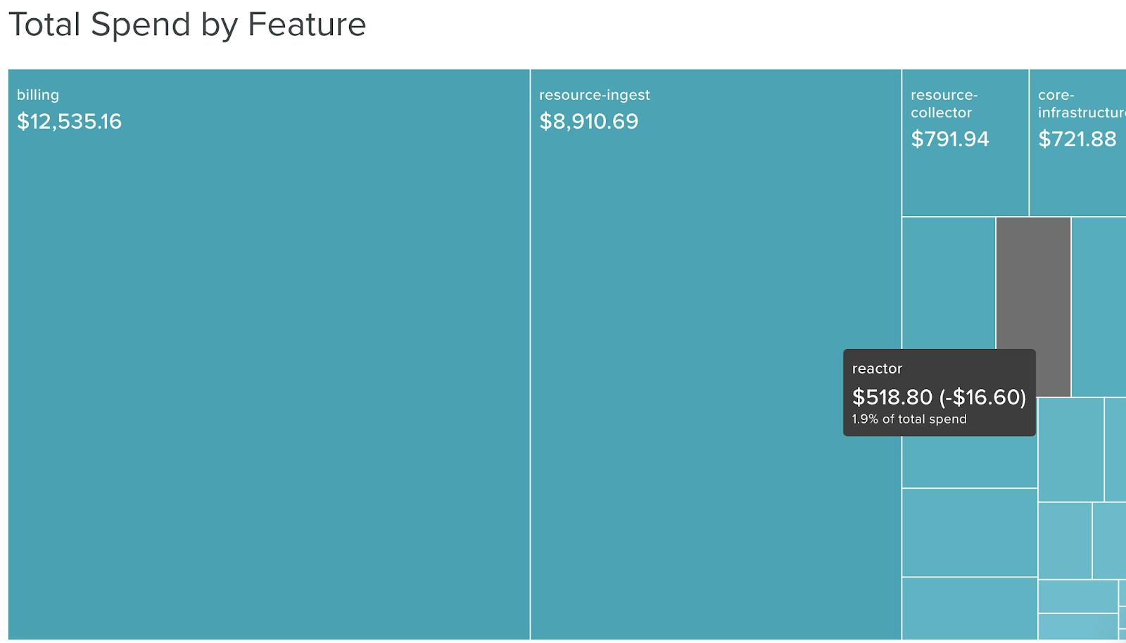
Sometimes, the best way to keep the s*&t from blowing up is to just calmly keep your eyes on the road. But with the complexities of cloud cost, it can be difficult to get a big picture view of how those thousands of individual billing line items turn into COGS for your business. The CloudZero dashboard offers treemaps for that big picture, eyes-on-the-road view. The Top Feature map, for example, shows your top 10 features by monthly cost and shows how they relate to each other. Do you have ten features that all contribute evenly to COGS? Or do you have one or two massive expenditures that dwarf all the others? If so, maybe they are a good place to target some re-architecting.
There are a few examples of how the CloudZero dashboard keeps you safe from the debris that might fly in your face otherwise when your monthly AWS bill comes in. Profitable innovation requires understanding cost in context of your business, and it’s easily achieved with CloudZero.
Source: https://en.wikipedia.org/wiki/Dashboard
